Stashbox


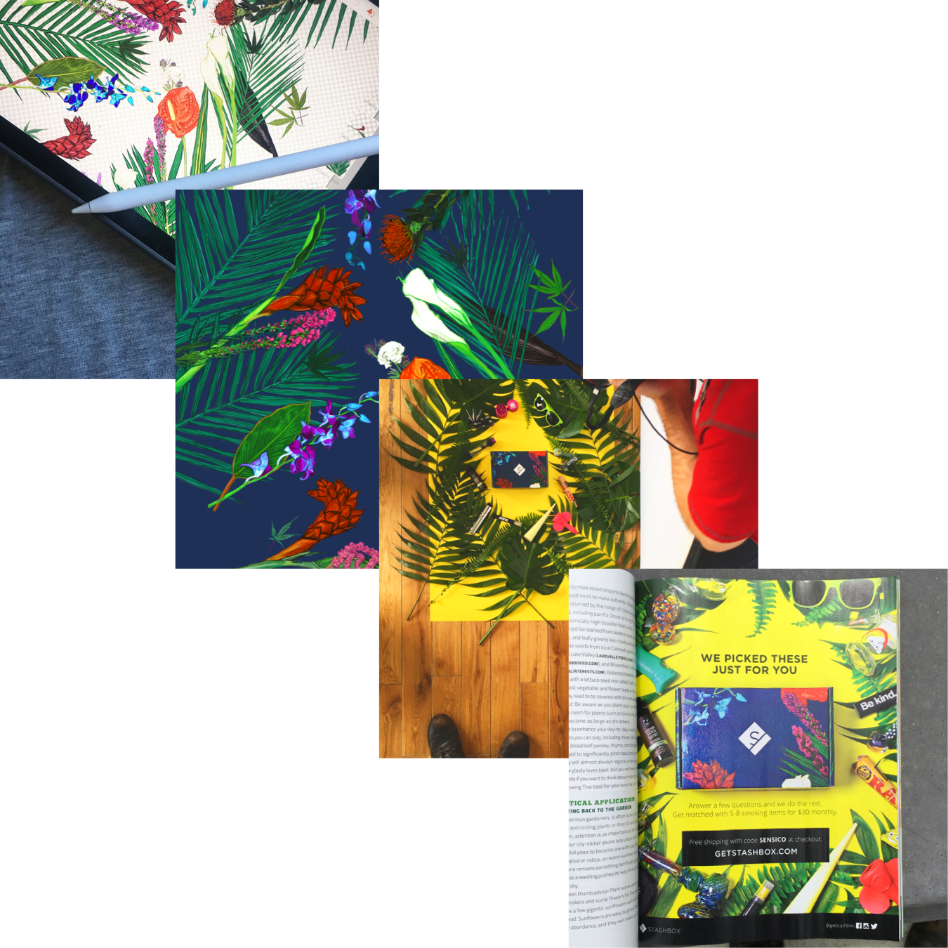
The ancillary cannabis market is crowded with loud packaging and psychedelic visuals that can overwhelm even experienced consumers. As Creative Director, I shaped the Stashbox brand to offer a clearer alternative. From visual identity to messaging to the themed box experience itself, every element was meticulously crafted to feel approachable, modern, and cohesive.

The minimalist Stashbox logo features the Stashbox "S", representing smoke emerging from a flat interpretation of the physical subscription box. Inspired by retro consumer brands of the '50s and '60s, the Stashbox mark was designed to be bold, familiar, flexible, and unique in the cannabis space, intentionally avoiding the typical "pot leaf" logos often seen in this industry.
The Stashbox brand was devloped to evoke trust and familiarity in an industry plagued by confusing, and intimidating visuals and language.

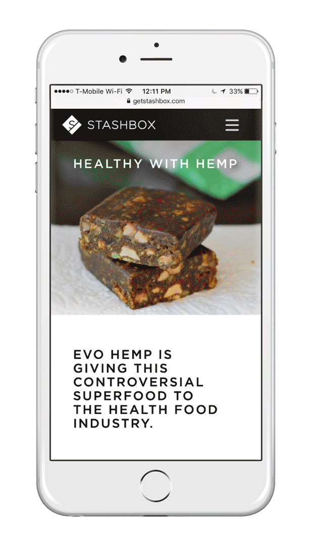
Every month, Stashbox introduces subscribers to a new box theme that leverages product partnerships to deliver a unique monthly experience that's curated to each subscriber.